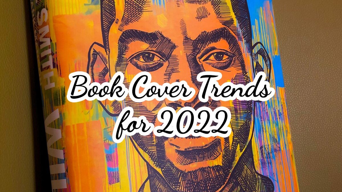
9 Eye Catching Book Cover Trends 2022
So, you have written a book. You have the manuscript and you know it might need some editing – perhaps a bit of feedback from friends of family too before publishing it. You want some different pairs of eyes to go through it and give you some honest opinions. However, if there is one thing most people overlook, that is the cover. As long as they doesn't work with a professional book designer. They literally do wonders with covers.
Book cover design and useful self-publishing guides
Get a Professional Cover Our Authors' corner
If you read a lot, you have probably noticed some cool book covers out there, as well as covers that look like they were designed in the 1990s. In fact, there are books who draw your attention and convince you just because they have the right cover. If the cover looks like one of Sandra Brown’s covers from the 1990s, chances are you will not even pay attention to it now.
Book cover design trends change every now and then. What worked in the 1990s did not work in the 2020s. On the same note, the new decade has brought in some different trends. Of course, it depends on the genre and type of book you have written, but then, here are some of the best trends to keep in mind for your upcoming release.
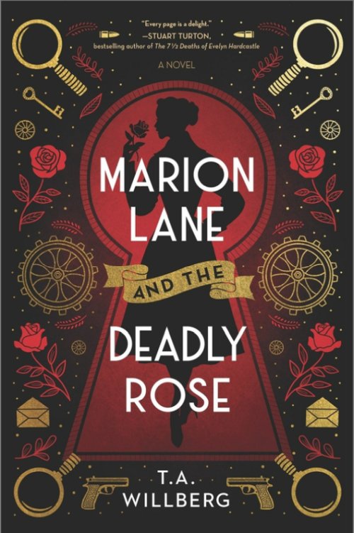
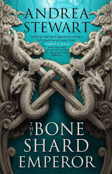
01 Gold, Gold, Gold powerful and charming
Gold can be a powerful color if you use it accordingly – and for the right type of book, of course. As you go through new releases, you will see more and more gold in titles or symbols. It makes no difference what type of background it goes against – gold will always look shiny and can draw some positive attention straight away.
Now, it also depends on the book. For example, you write fantasy and you feel ready to come up with an extended series. Whether it covers princes, knights, elves or warrior Amazon women, large gold letters in a mystical font are better than plain light gold letters. On the other hand, a self-help book or perhaps a biography will do with a simple and straight font in a lighter nuance of gold.
Gold should not be used for letters only. Instead, you can come up with a few different nuances of gold, as well as a few symbols here and there. Try to send the focus in one direction. What is the main element of your cover? That is where the more intense nuance of gold should go. Throw it against a contrasting background as well, only to make sure it is visible and stands out.
02 Bold letters draw attention
The typography is critical when interested in cool book covers. You do not want people to struggle to read the title or the author’s name. Instead, you want it to be visible from miles away. Bold letters and typography have been in use for a few years now. This trend will definitely not slow down because it is successful and it helps with sales, so it will most likely stick for a while.
The idea behind bold typography is fairly simple to understand. Potential readers exploring a bookstore will inevitably spot large letters and titles. The same rule applies to those who look for an online book – being able to read the title in a second does make the difference. It will catch the readers’ eyes, adding to the sales.
This is the reason wherefore so many designers rely on large and bold letters. You see the title straight away and you give it an opinion. If you have to squint to read the title, you will give up before even taking a look at the rest of the cover. You want people to see the title regardless of where they look. Even if it is not their type of book, it draws attention and might as well push them to pick it up.
Other than that, chances are designers will bring in capitalized fonts as well. They are common these days, but such fonts are used as a statement. Both new and famous writers rely on this trend. Sure, the rest of the cover does matter too. Organic touches can make the difference, so no matter how bold and large the typography is, keep it clean.
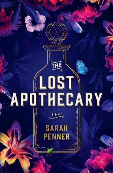
03 Flowers keep things clean
You do not necessarily need to write a chick flick to bring in flowers for your cover. It does not have to be one of those books empowering women – or even a book about gardening. Flowers can be used in a wide variety of scenarios and they are just as handy for self-help, fantasy, thriller or romance books. You name it, it can be done.
When it comes to flowers, there is a trend to keep things clean, this is one big book cover trend of 2022. Basically, you do not have to overfill your cover with differently covered flowers. You do not want an explosion of colors because the cover will look like kitsch. Chances are it will look cheap and it will not draw too much attention – it looks like you hire a 16 years old freelancer to design it.
Instead, opt for something dark, clean and elegant. For example, you can use a straight capital font with thin letters against a dark background. A few flowers in the shadow will maintain the clean profile, while the slightly dark appearance will maintain the elegant appearance – rather than a bunch of brightly colored flowers.
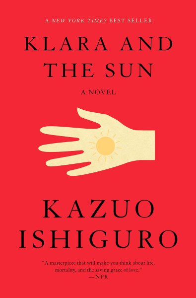
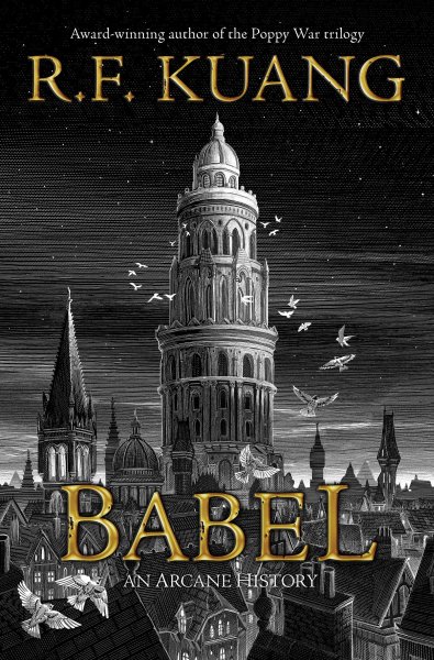
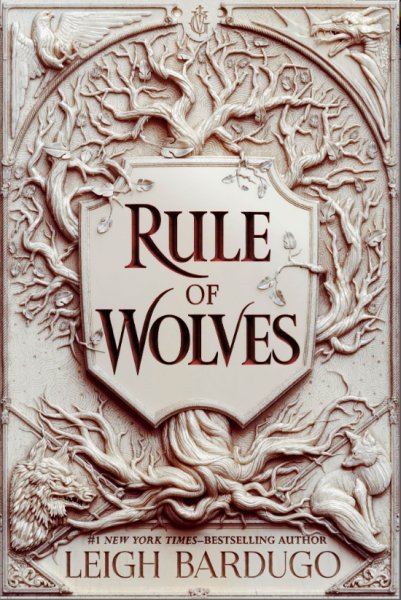
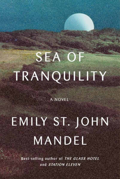
04 Minimalism is a plus
Whether you use flowers or something else, minimalism is clearly a plus and one of the most popular book cover design trends these days. Some of the best books out there – including self-biographies from important people – feature cool book covers and lots of minimalism. Graphic designers focus on simplicity because everyone can understand what the book is about – simple as that.
For example, you may find book covers with nothing but a simple background – no elements. The title and the author’s name are clearly written, but not in big letters. The simplicity is exquisite and people will know exactly what the book is about. It looks good and the trend is quite new, so it definitely draws some attention.
Then, you may also find books with a single image and one color. For example, a biography may have the author’s face and nothing else. Sometimes, they even come in black and white. The reader is indirectly told to focus on the central element – this is the main element of the book. Plenty of white space in the cover will also help increasing the focused impression.
05 Gradients with vivid colors
Gradients are modern – no doubt. They bring in a geometrical style that will turn boring covers into cool book covers. It is not the most stylish type of cover out there. It is not the most impressive one in terms of graphics. However, it is a modern trend that will tell everyone that your book brings in a fresh breath of air – simple as that.
Different colors bring in different effects. Based on current trends, it looks like an orange, pink and purple are among the most common colors for gradients. Sure, your options are countless, but stick to something that is representative for your book. Each color underlines a particular thing, so choose your gradients wisely.
06 Hand drawn letters and art are cool
This trend works wonders for some types of books, but not for every genre. It looks a bit mystical and sometimes childish, so it may not be a good idea for a self-biography or perhaps a thriller. Instead, hand drawn covers are more appropriate for fantasy books. Hand drawn letters for chick flicks and generally feel-good books that do not require too much thinking, lots of plot twists and philosophies.
Other than that, children’s books can also work wonders with hand drawn letters, not to mention mystery books. These curves bring in a bit of a challenge. The trend is less likely to go away because the illustration looks good. But then again, make sure you use it for the right type of book, or you could mess everything up.
07 Retro elements are back in trends
Retro elements make some cool book covers too. At times, it may feel like graphic designers are slowly bringing back the trends from the 1970s, which feel quite cool today. You can see this style coming back everywhere. Even TV shows of those times are brought back to modern audiences and the same rule applies to book covers.
Some people relate it to the nostalgia associated with those times. But even if your audience is younger, it does not mean that you can go wrong with this style. For example, some will associate the style with their parents’ books. Some others will find this style to be quite simplistic and elegant – a few nice colors and a crystal-clear test on the cover.
What does the style imply? Simple – fonts from the 1970s and some bright and vibrant colors. From many points of view, such a book looks like a classic. It will draw attention because despite being old, the style looks quite new for the younger audience, so your book will be more popular on the shelf.
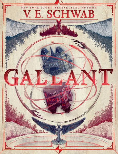
08 3D concept art is extremely modern
3D concept art will draw instant attention among certain audiences. This style can bring in anything – from architecture and animals to monsters and everyday objects. Everything is designed in crisp and modern 3D graphics. For a better effect, graphic designers tend to bring in a lot of shades as well – they add to the dramatic profile of the cover.
This style is suitable for a few different categories of books. For example, fantasy and mystical books will work great with modern designs – a sword, the tentacles of an octopus, some monsters, a robot and so on. There are lots of ideas, but make sure they have a slightly aggressive profile for a better effect among your readers.
Shades make the respective concept more dramatic. Apart from fantasy and mystical books, modern thrillers or police and detective books can also do with such a concept. At the same time, a serious book regarding particular concepts will work wonders too – it could be anything, from politics and racism to society and finances.
The style is not really suitable for dramas though.
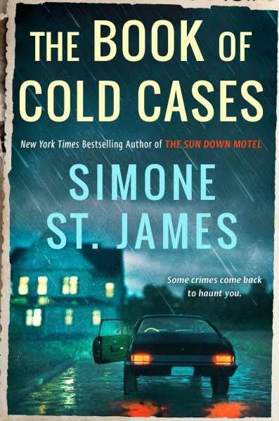
09 Genuine photos (with noise) tell a story
Last, but not least, it looks like genuine photos make some cool book covers and for a bunch of different reasons. For example, you can forget about stock photos for a moment. Even if you find some rare stock photos, chances are someone is already familiar with the concept and the cover will not really look unique to potential readers.
Use authentic photos instead, regardless of where they come from – your garden, a nearby landscape, or perhaps a life event. Such a photo has a clear profile – it builds an instant relationship with whoever sees the cover. You can also use pictures of people in order to underline particular feelings – your options are countless.
More and more designers rediscover the power of photography because high quality photos are easy to get. Stock photography is slowly fading away. Instead, real shots of events, people and places represent the new way forward. This trend does not apply to books only, but also to magazines and perhaps websites as well.
Obviously, this trend is not suitable for every type of book. You need to be very careful, or you could ruin everything. It is a good idea for feel-good books, biographies and social books – not that great for thrillers, fantasy books and general fiction.
Conclusion
If you have time to play with covers, maybe you have a cover draft design you would like to test, try our AI fiction cover reviewer tool. The tool uses state of the art machine learning to match you design with up to 500 real life book covers available on Amazon.
As a short final conclusion, as you explore a bookstore or check out the Internet for the bestselling books, you will notice the cool book covers follow one or more of the above-mentioned trends. No matter how book it is, keep in mind that the cover is the first thing people will see. Therefore, you need to make a good impression straight away.
Unless you are experienced with graphic design, it might be better to simply rely on professional service – ideally, a service with a good reputation in terms of book covers. These were the most important book cover trends for 2022.
Book cover design and useful self-publishing guides
Get a Professional Cover Our Authors' corner
My profession is online marketing and development (10+ years experience), check my latest mobile app called Upcoming or my Chrome extensions for ChatGPT. But my real passion is reading books both fiction and non-fiction. I have several favorite authors like James Redfield or Daniel Keyes. If I read a book I always want to find the best part of it, every book has its unique value.


