Daal Rice – The Saga by Sangeeta Dixit
[wp-review]
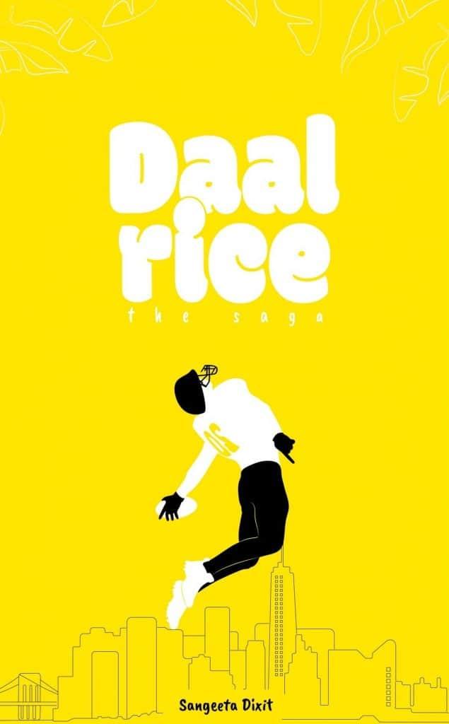
Strengths:
+ Trendy three color design
+ Small particles (leaves on the top) are giving an extra boost for the design
+ Main title font style and size (strong and impressive)
Weaknesses:
– The low contrast (yellow and white) causes readability issue, especially in case of subtitle and author name where the letters are small
– The low contrast also damages visual parts: hides the top leaves and weakens the player's body
Categories