South of, Lights End by Lisa Terry
[wp-review]
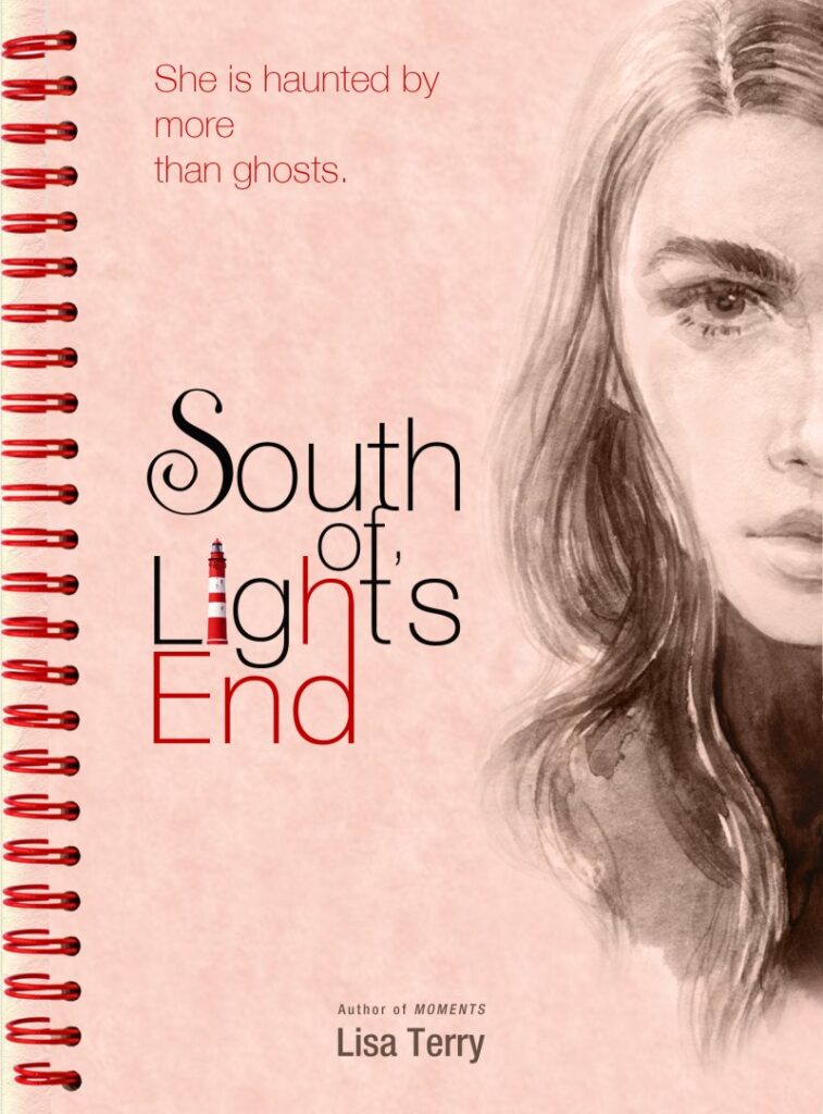
Strengths:
+ Great first impression, good color choices
+ The girl paint is definitely stunning
+ Cool font face for the title
+ The lighthouse in title is definitely creative, it hints something from the story
Weakness:
– The spiral binding as part of the cover design doesn't add anything, but reduces the space of the title
– The author's name is hardly readable
– The top text (story insight) seems to use another color and font style than the other texts and titles
Overall, the concept of the cover is great. I think the cover is an engaging one.
Categories